
What I’m Loving on My Squarespace Home Page Right Now

Scroll With Me
I’ve been meaning to share some of the extra touches I’ve added to my Squarespace site… the little details that make it feel more immersive. More scrollable. More me and my brand.
This is the first in a short series on elevated squarespace site touches I love.
Starting on my site then beautiful client sites too.
Things you might want for your site too.
Here are a few of my favorite touches:
☐ A custom scroll bar in my brand colors
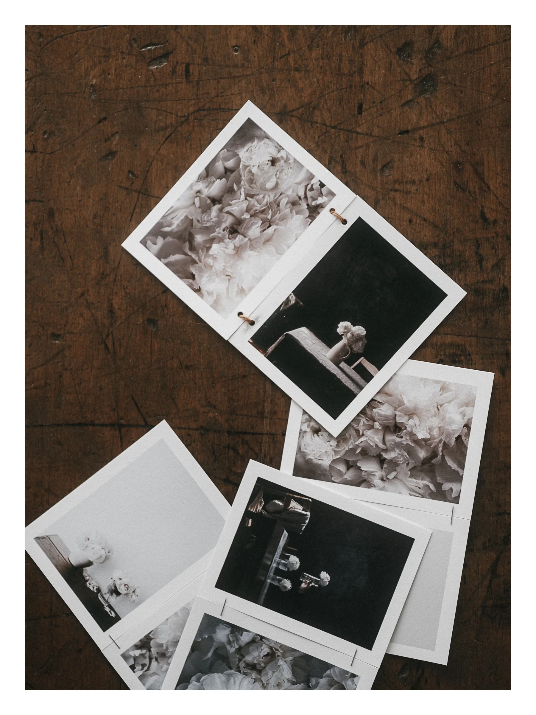
☐ Images that move independently of the text as you scroll
☐ A vertical video with no black bars… clean and calm
☐ A ‘get in touch’ button that gently follows you down the page
☐ Blog posts divided by category (AI, Lightroom, White Space) so it’s easier to find what you’re looking for.
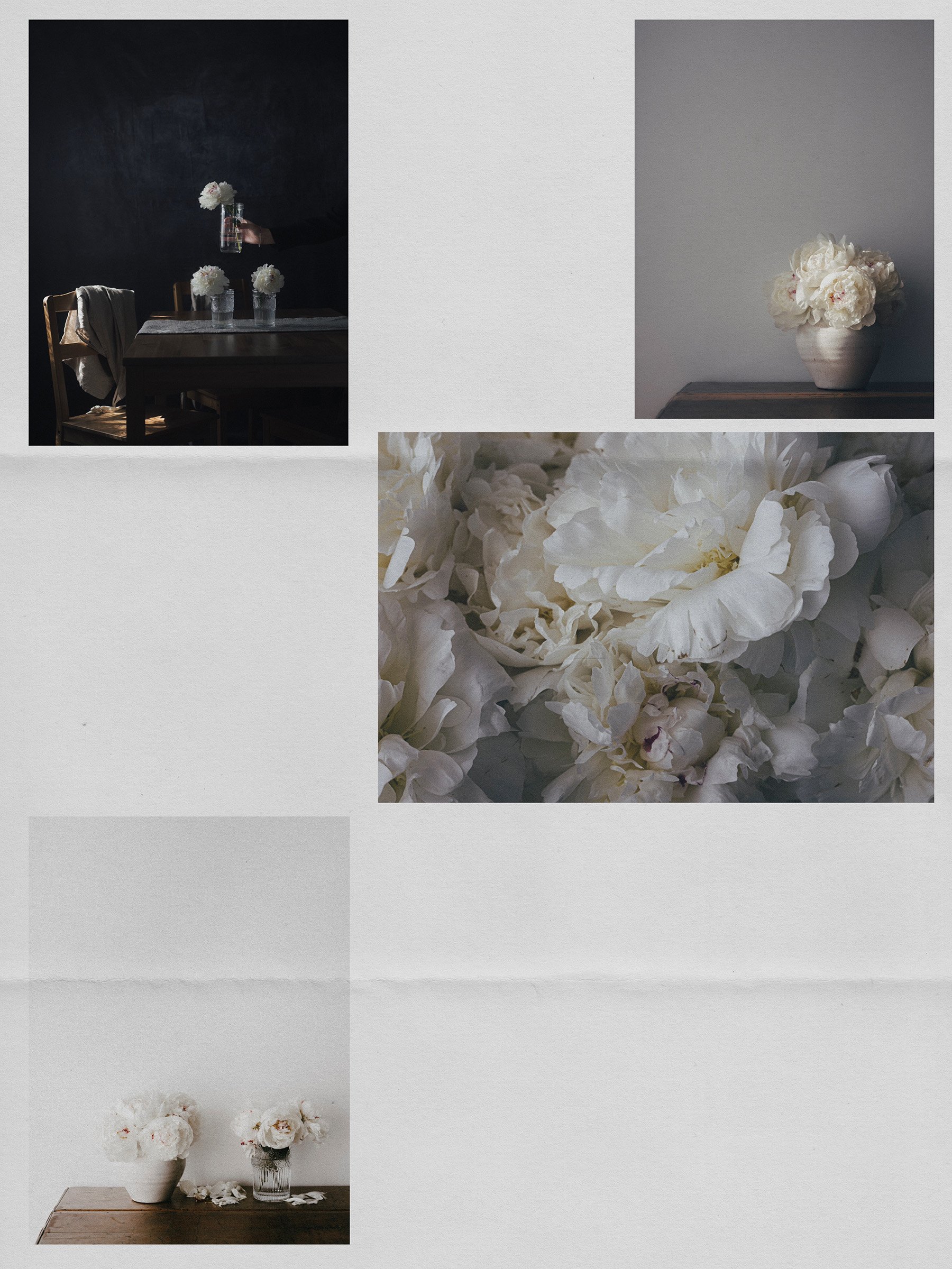
☐ Horizontal, stacking, scroll sections with layered hover images.
☐ A mini scrolling gallery that pauses when you hover.
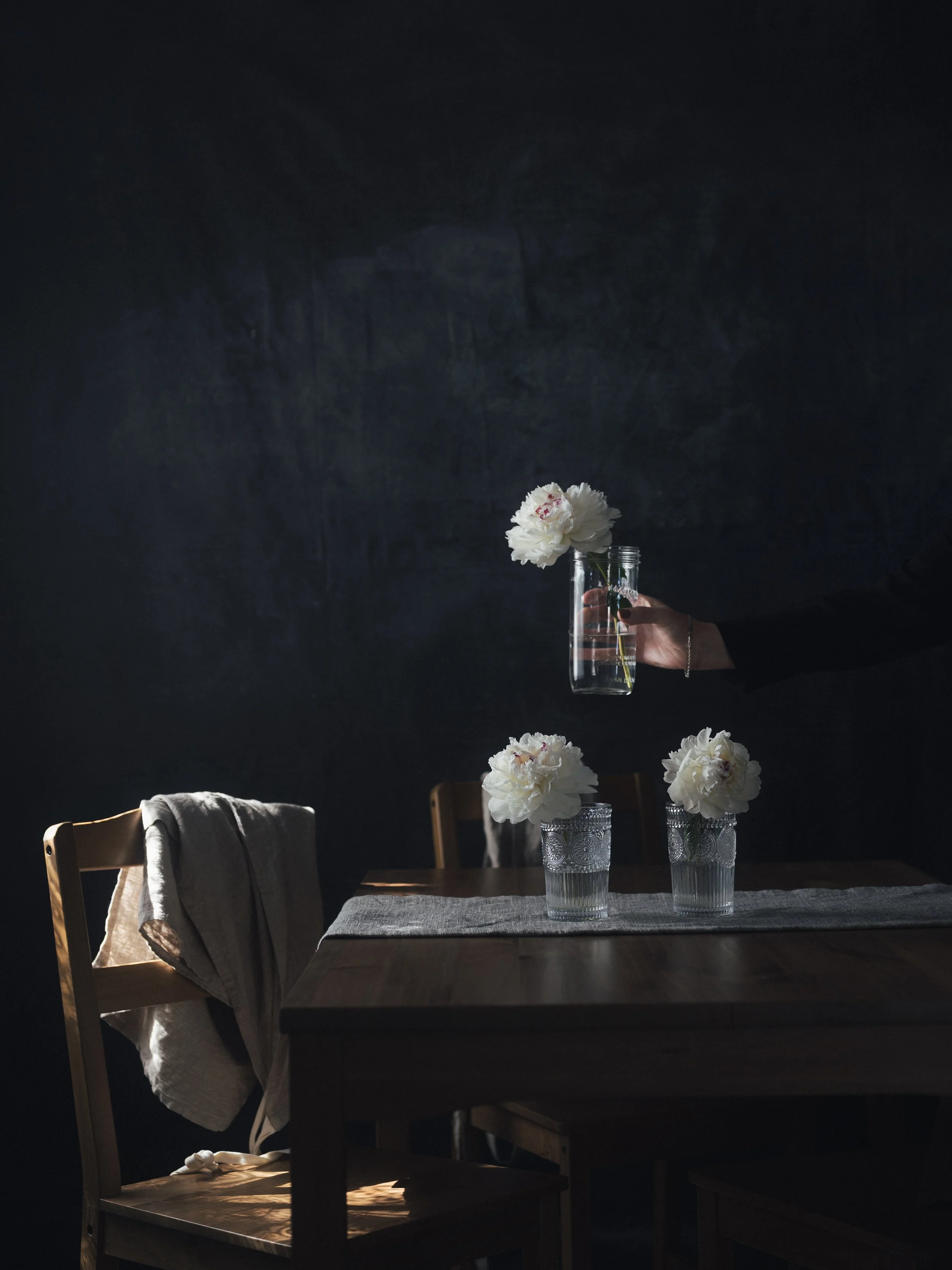
☐ A textured footer with balance and motion
One of my favorite sections is right near the bottom.
The mix of fonts. The soft motion. A simple hover effect around the image. It all comes together.
If you’re thinking about updating your site or building one from scratch, and you want it to feel more personal and scroll-worthy, I’d love to help. Especially if you’re working with beautiful images and want the design to align with your beautiful work.
Send me an email and let’s chat.
A few things to Notice when you’re Building your Own Site
(or updating the one you have.)
Lately, I’ve been paying extra attention to what makes a site feel good, and what throws the experience off.
I landed on a beautiful site recently… designed by a real designer, paid and everything. But something was off. The alignment. The balance. The way things were sitting on the page. From left to right, it felt uneven. Uncomfortable to the eye.
And once you see that, you can’t unsee it.
Another thing I’ve noticed: overlapping images are everywhere now. Probably because they’re so easy to create in Squarespace. And they can look amazing when done well. But if the images get cropped awkwardly or the placement doesn’t make sense, it starts to feel more like an oops then intentional.
None of this has to be complicated. But it does need a bit of care.
A Few Details Worth Noting
☐ Keep alignment in check — not just left to right, but in how elements relate to each other.
☐ Make sure overlapping images don’t lose their meaning or get cropped in strange ways.
☐ Leave enough space between blocks and sections (white space is a tool, not just a style).
☐ Be intentional with motion — it should guide the eye, not distract from the content
☐ Choose typefaces that don’t compete with your images or story
If you’re building your own site, these little shifts can make a big difference. And if you’re working with a designer, these are great details to speak up about.
And I just have to say it.
WHITE SPACE.
♡
If you’re feeling inspired to refresh your Squarespace site or want help bringing your vision to life, you can read more about my services here.
Helping talented creatives design websites that align with their aesthetic and goals is one of my FAVORITE THINGS to do.
Here’s to beautiful, meaningful design.
Over to You
As always, I love knowing you were here.
Please say hello and share your thoughts in the comments below.
xx
Kim
You Might Also Enjoy
Studio note .05 - White Space Letter print packages, another different kind of diptych tutorial and two of my favourite journals.